- Published on
React + TypeScript + Next.js + TailWindCSS 创建项目
- Authors
- Name
- DP Piggy
- @xiaozhudxiaozhu


创建项目
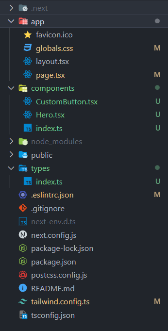
先看一下整体的项目目录结构:
使用 Create Next App 创建一个 Next.js 项目:
mkdir demo
npx create-next-app@latest ./
然后删除默认生成的 page.tsx的多余的代码,只保留必要的代码:
export default function Home() {
  return (
    <main className="overflow-hidden">
      <h1>Hello World</h1>
    </main>
  )
}
新建一个 components 文件夹,在 components 文件夹中创建 Hero 组件:
import { Hero } from '@/components'
const Hero = () => {
  return <div>Hero</div>
}

export default Hero
为了方便统一管理的话,我们也可以新建一个index.ts文件,用于管理组件:
import CustomButton from './CustomButton'
import Hero from './Hero'

export { Hero, CustomButton }
这样就可以方便使用了 Hero 组件了
import { Hero } from '@/components'
export default function Home() {
  return (
    <main className="overflow-hidden">
      <Hero />
    </main>
  )
}
配置 TailwindCSS
在全局样式 global.css 中书写基础样式,在 tailwind.config.ts / tailwind.config.js中配置 Tailwind:
- content:指定要处理的文件
- mode:设置为 jit 模式
- theme:扩展默认主题
- colors、字体等
- plugins:添加插件
global.css
@import url("https://fonts.googleapis.com/css2?family=Manrope:wght@200;300;400;500;600;700;800&display=swap");

@tailwind base;
@tailwind components;
@tailwind utilities;

* {
  margin: 0;
  padding: 0;
  box-sizing: border-box;
  font-family: "Manrope", sans-serif;
}


.max-width {
  @apply max-w-[1440px] mx-auto;
}

.padding-x {
  @apply sm:px-16 px-6;
}

.padding-y {
  @apply py-4;
}

.flex-center {
  @apply flex items-center justify-center;
}

.flex-between {
  @apply flex justify-between items-center;
}
tailwind.config.ts
/** @type {import('tailwindcss').Config} */
module.exports = {
  content: [
    './pages/**/*.{js,ts,jsx,tsx,mdx}',
    './components/**/*.{js,ts,jsx,tsx,mdx}',
    './app/**/*.{js,ts,jsx,tsx,mdx}',
  ],
  mode: 'jit',
  theme: {
    extend: {
      fontFamily: {
        inter: ['Inter', 'sans-serif'],
      },
      colors: {
        'black-100': '#2B2C35',
        'primary-blue': {
          DEFAULT: '#2B59FF',
          100: '#F5F8FF',
        },
        'secondary-orange': '#f79761',
        'light-white': {
          DEFAULT: 'rgba(59,60,152,0.03)',
          100: 'rgba(59,60,152,0.02)',
        },
        grey: '#747A88',
      },
      backgroundImage: {
        pattern: "url('/pattern.png')",
        'hero-bg': "url('/hero-bg.png')",
      },
    },
  },
  plugins: [],
}
使用 TypeScript
在 types/index.ts 中定义组件参数的 interface:
export interface CustomButtonProps {
  title: string
  containerStyles?: string
  handleClick?: MouseEventHandler<HTMLButtonElement>
}
在组件中使用接口定义参数类型:
import { CustomButtonProps } from '@/types'

const CustomButton = ({ title, containerStyles, handleClick }: CustomButtonProps) => {
  // ...
  return (
    <button
      disabled={false}
      type={'button'}
      className={`custom-btn ${containerStyles}`}
      onClick={handleClick}
    >
      <span>{title}</span>
    </button>
  )
}
最后在使用组件的地方传递对应的参数。
const handleScroll = () => {
 ...
}

<CustomButton
     title="Explore Cars"
     containerStyles="bg-primary-blue text-white rounded-full mt-t10"
     handleClick={handleScroll} />
这样就可以利用 TypeScript 的类型系统定义参数类型,提高代码质量和类型安全性。
总结
- 使用 Create Next App 快速创建项目
- Tailwind 处理样式
- TypeScript 提高类型安全性
- 将组件进行拆分重用